In the world of email marketing, there are two metrics that you have to pay close attention to in order to not only measure your success but fix the areas that are the cause for poor performance. The most important is your open rate, which our team did a deep dive into that you can find here. You won’t be able to improve your CTR if no one is even opening your email…
Second to open rates is your click through rate (CTR), which is critical when keeping track of your email’s overall success: This is the next area that you need to focus your attention on after you’ve got your subscribers through the door.
Now, in order to boost your CTR, it’s important to understand what it is. CTR is the aspect of your email that determines if your audience actually gives a s*** about what you’re offering. CTR’s are the number of clicks your Call to Actions (CTA) or buttons receive, divided by the number of emails you sent. Any “book now” or “learn more” that directs your subscribers to a website is an action. It’s crucial to keep track of those clicks so you can determine what is and isn’t working.
CTR vs CTOR – Knowing the Difference
There is one area of confusion that can pop up when tracking your email’s metrics. CTR is the more well-known terminology for measuring clicks, but another metric exists that can be a real head-scratcher. CTOR’s or email click to open rate is the number of people who clicked on a link in your email compared to the number of emails opened. You’re probably thinking, isn’t that what a CTR is? Almost, but not quite. The only difference between the two metrics is that CTR is based on the number of emails sent and CTOR is based on the number of emails opened. It’s a tricky little detail, but CTOR seemingly gives better results since the percentages are generally higher (you know, math…). Ultimately, they provide the same information, just using a different source.
Now that we’ve cleared that up, let’s take a closer look at how to give your CTRs a serious upgrade.
1. Focused Layout/Flow
Think of the layout of your email as a pathway that you want to lead your subscribers down. From top to bottom, it should be a journey with no resistance, with a clear end point (your CTA). Having distracting colours at the top, too much text, multiple columns and an unclear CTA can really impact your CTR. Don’t be afraid to hold your audience’s hand as they navigate through your email. Make it abundantly clear that all you really want is for them to click that button.
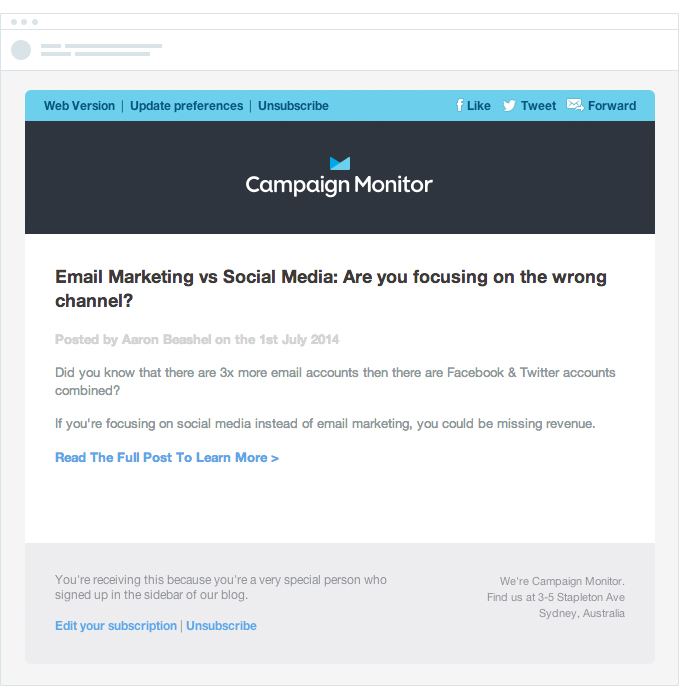
To give you a visual, Campaign Monitor tested the theory of a focused layout by redesigning one of their emails promoting a recent blog post. This what the email looked like before:
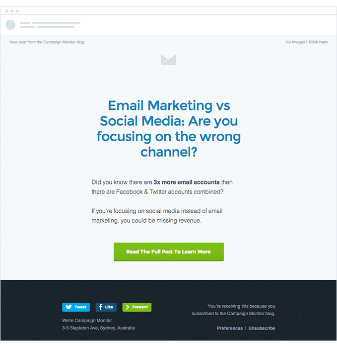
And this is the email after their redesign:
By eliminating the bulky header, changing the text, updating the overall flow and by adding a very clear CTA button, Campaign Monitor increased their CTR by 127%. Talk about an improvement!
2. Optimizing for Mobile
No surprise here. Mobile devices are starting to call the shots in the marketing world and emails are no exception. As of this year, HubSpot stated that 46% of email opens will occur on a phone. Think about how many of us use our phones to leisurely scroll through emails, click buttons and fall down a rabbit hole of websites until somehow an hour has gone by. Ensuring your emails are properly optimized for mobile viewing is an absolute must.
If you’re not sure how to properly build emails for mobile devices, MailChimp, Klaviyo and Campaign Monitor (and almost every other email building software) have this function built in so you can design with ease. If you are still feeling unsure, reach out to our team! We would love to help you.
3. Call to Actions and Buttons – Less is More
We can’t stress this enough. Imagine walking down a hallway to find 6 doors, all leading to the same place. Not only is that extremely confusing, but it’s frustrating, trying to decide which door to take and why on earth there are so many options. This is the exact same emotional journey that you put your subscribers through when you place one too many buttons in your email. If you only have one place you want to redirect your readers towards, use a “less is more” strategy.
4. Serial Position Effect
The Serial Position Effect is a psychological term that refers to a person’s ability to only remember the first and last thing they read more often than the content in the middle. In marketing, copywriters call this adding a P.S. section, and yes, it’s exactly what you think it is. The P.S. section can be found at the end of your email and its prime real estate for catching your reader’s attention. The majority of readers will scroll quickly through an email after they’ve read the headline, right to the bottom knowing that they can find more info or a link. Placing a strong CTA and/or button at the bottom of your emails will not only boost your CTR but also increase the chances of your readers actually remembering the content of your email.
5. Segmentation
We said it once, and we’ll say it again. Segmentation will not only increase your open rate, but it will do wonders for your CTR as well. Placing all of your subscribers into different groups based on their behaviours, interests, location, etc. means that you have the upper hand. Knowing what variables contribute to a reader actually performing an action in one of your emails is almost like predicting the future. Having that much knowledge about your readers means you can create emails that are custom to each group, resulting in much higher chance in clicks (203% to be exact).
The Bottom Line
Email marketing is a beast. There are a number of factors at play and by some miracle you’re expected to master them all. Fortunately, doing that isn’t entirely impossible. Spending more time understanding your key metrics (open rate and click through rate), utilizing the number of tools that email marketing platforms like MailChimp, Klaviyo and Campaign Monitor offer, and creating quality email content is all it takes. It may be a long journey but starting with understanding your metrics and what areas may need improvement is the perfect place to start.
Have any exciting results from a successful email campaign? Share them with us!
———-
Article Written by:
Angelica Nicole Greene-Barrales
Marketing Lead at Little Bear in the Forest | Digital Marketing Agency


