Whether you have an eCommerce platform or not selling, your goal is to convert website visitors into leads by engaging them with valuable and relevant content. With just a few words, pop ups can do the trick by implementing strategies such as offering free information or providing discount opportunities your visitors won’t want to miss. But how would you know if your pop up is working? Through this blog, I will walk you through the steps in developing a popup to increase your conversion rates.
Design
Executing your brand through a design strategy is an important part of building trust with your website visitors. If your designs are not engaging enough for your visitors, then you are less likely to convert them into leads. According to an article on Qualzz, “People make up their minds within 90 seconds of their initial interactions with either people or products.”. So, it is advised to stay on top of the visual aspect of your pop up with colours, fonts, buttons, and images.
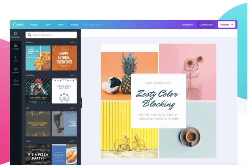
If you do not have a strong design background, don’t fret. Great tools like Canva can help you throughout your pop up design process. Their free platform offers high resolution images for your needs, including a plethora of fonts, buttons, colours, and design elements. Personally, it has been my saving grace for designing graphics for my newsletters, etc.
Offer a value
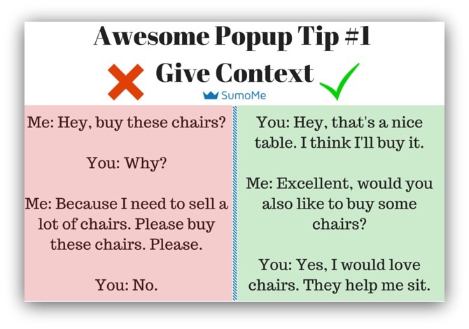
Providing relevant and valuable content can be a great approach to attract more clicks on your pop up. Depending on your service or product, you can implement different strategies to generate more leads by offering a free eBook for download or a top tips list. Formulating content such as “Get 50% off your first purchase today, limited time only” will entice your visitor enough to convert.
An exit pop up is when a visitor attempts to leave your landing page. The pop up will appear to re-engage your visitor to buy in to what you are offering. Get Match suggests that offering a discount may be a better option for an exit pop up strategy “For a new visitor, a discount isn’t relevant unless they’re already considering purchasing.”
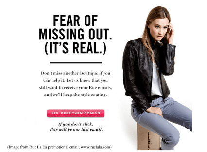
Fear of Missing Out
In your pop up, you can implement keywords such as “Last call on this sale”, “Get your 50% off today before the sale ends” to also “Only a few days left before this sale ends” to grab their attention.
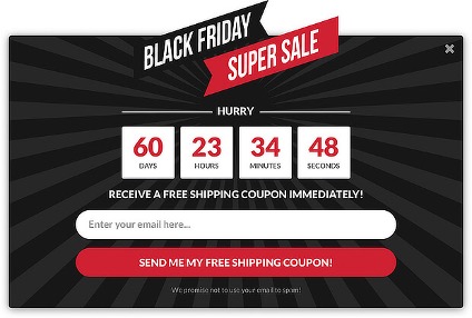
Using these phrases can encourage visitors to make an immediate decision. You want to essentially make your visitors feel like they absolutely cannot miss out on the opportunity you are offering.
These pop up from Optinmonster provide a great example of fear of missing out.
Time Your Pop Up
Implementing a time strategy for your pop up can assist in increasing your conversion rates. Usually, organizations will have an entry pop up as soon as a visitor lands on their page. However, data proves that the lower in seconds you serve your pop up, the least conversion rates you will receive. For example, organizations like Get Matcha have obtained results through testing to verify the best number in seconds to apply a delay. We see that 30 seconds has the highest amount of conversion rate compared to 4. However, they have suggested serving your pop up at a 6 second delay, as more people will see the pop up, which will increase the number of leads.
Testing
It is essential to test your pop up to verify which content engages your target audience. You can start by viewing your analytics, either on your website dashboard or through Google analytics. Without testing, you won’t have a clear idea of what is working vs. not. You can do A/B testing by enhancing your content, such as offering another type of incentive or changing your colour, fonts, and images. Businesses that constantly A/B test their pop up usually see an increase in conversion rates.
A/B testing is when you have two different types of variations, A and B. You do A/B testing to have a clear understanding of what your target audience is more engaged to.
As a Final Observation
Building a clear understanding of what your target audience is engaged in is the first step of your pop up strategy. It’s good to stay laser focused on your designs and the type of content you are offering to build trust and brand credibility when presenting your pop up. Your popup strategy should also consider evoking that fear of missing out to capture your audience’s attention. And remember to stay on top of your testing to see what works vs. not. It will take a few times to get a clear understanding of what your visitors are responding to, but you will eventually get the hang of it. Happy building!
—–
Article Written by:
Sharon Espinal
Content and Digital Marketing Specialist | Digital Marketing Collective


